Title
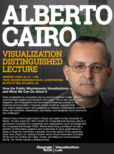
How the Public Misinterprets Visualizations —and what we can do about it
Abstract
Data visualization is a powerful way to uncover patterns in data, and to communicate insights and stories to the public. This is why charts, maps, diagrams, and infographics are becoming increasingly popular in the sciences and journalism. However, recent evidence suggests that non-expert readers aren't well equipped to interpret visualizations correctly. What can scientists, statisticians, journalists, and designers do to overcome this challenge?
Biography
Alberto Cairo is the Knight Chair in Visual Journalism at the University of Miami. He also works for UM's Center for Computational Science, and as a permanent consultant for companies and organizations such as Google and the Congressional Budget Office. Before becoming a professor he was a director of information graphics and multimedia at news publications in Spain in Brazil for more than a decade. He is the author of the upcoming How Charts Lie: Getting Smarter About Visual Information (October 2019) and The Truthful Art: Data, Charts, and Maps for Communication (2016). His Twitter handle is @AlbertoCairo.


